
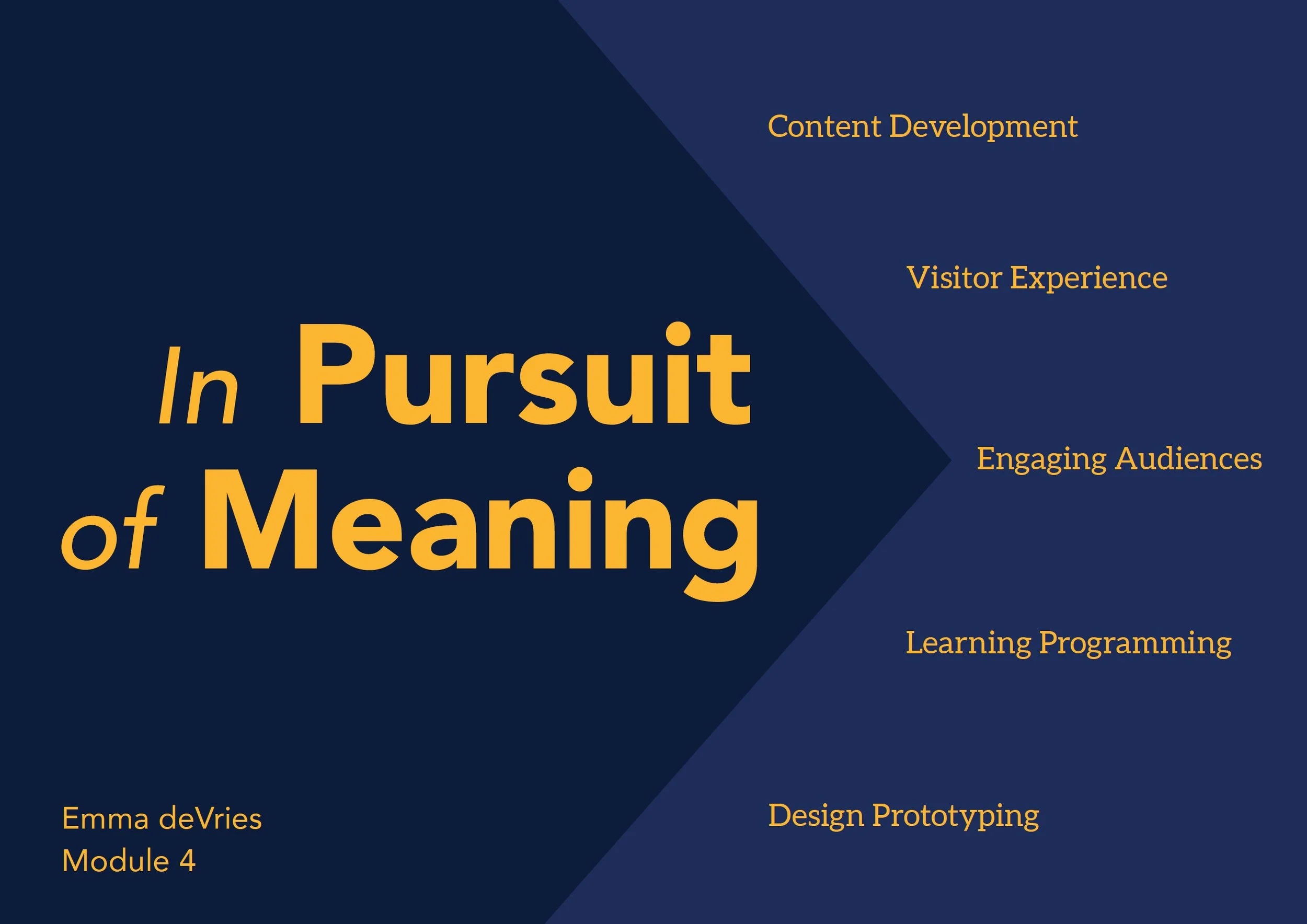
For Module 4 of my Master’s in Museum Studies course at the University of Leicester, we applied the lessons from lectures: learning theory, media and design, and exhibition planning to create a pop-up exhibit using an artifact from the Northampton Museum and Art Gallery. My group were given a concealed shoe.
The culmination of this module was a presentation that summarized the core lessons from lectures along with the practical understandings gained from researching and installing a pop-up exhibit.
“That what we really seek through design is to impart information: themes and concepts, facts and evidence, and to incite cognition and emotion that will result in understanding and meaning-making; to forge a firm and lasting connection between content and people in order to enrich their lives.”
Exhibition design is a sprawling process and encompasses many different areas of museum work (designers, education experts, curators, marketing staff) and my experience during the prototyping the museum portion of the module only reinforced this. The topics discussed in lecture guided my groups exhibit development. It was from the mind mapping sessions and ideation that interactives started to take shape.
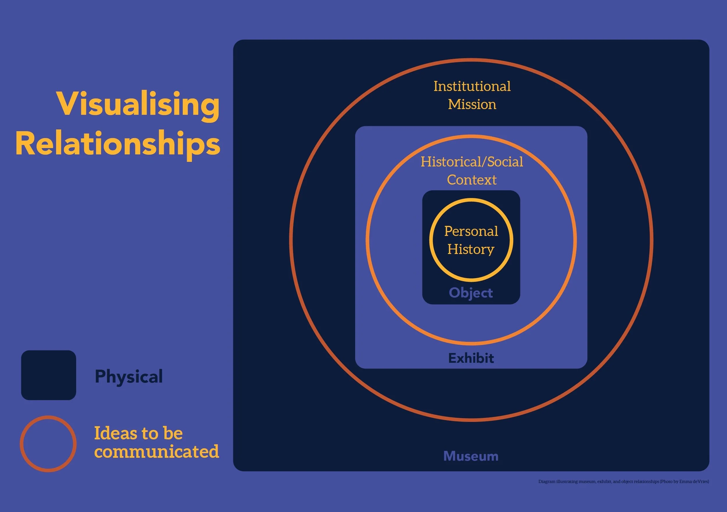
Diagram showing the relationships between physical objects or places and ideas that are being communicated through those relationships.
Throughout this entire design process it has been impossible to separate the exhibit into distinct sections. The “Good/Bad” interactive could not stand alone from the concealed shoe, just like the object would be adrift without the contextual framing we as a group developed. It’s important to note this interdependence between the object, labels, and interactives. Because, as I will demonstrate in the following examples, there are consequences to viewing interactives as “entertainment” as Witcomb describes in Interactivity Thinking Beyond.

Interactions in museums should be meaningful and provide an enriching experience for the visitors. Diagram illustrating museum, exhibit, and object relationships (photo by Emma deVries)
The public picks up on the negative characteristics of interactives, as digital travel editor Oliver Smith bluntly points out in his article 21 reasons why I hate museums. In particular he describes digital interactives as “shallow and irrelevant.”
Carelessly added on interactives that do not fulfill the museum’s intended learning outcomes are what I will now refer to as “token engagement”. Token Engagement distracts visitors and does not leave an impression “beyond the activity itself.”
Many interactives fail because the intent is misguided. Audiences do not need to be cajoled into engaging because the engagement doesn’t have to be fun. Yes, the activity should be enjoyable, but the medium must fit the content that’s being communicated. As Nina Simon’s says in The Art of Relevance “Fun is fun. It’s a charming distraction.” Not all subjects need to be interpreted through the lens of entertainment. Is the point entertainment or leading the user through the process of personal meaning making.

Detail of concealed shoe from (In)Visible exhibit (photo by Chloe Bowerbank)
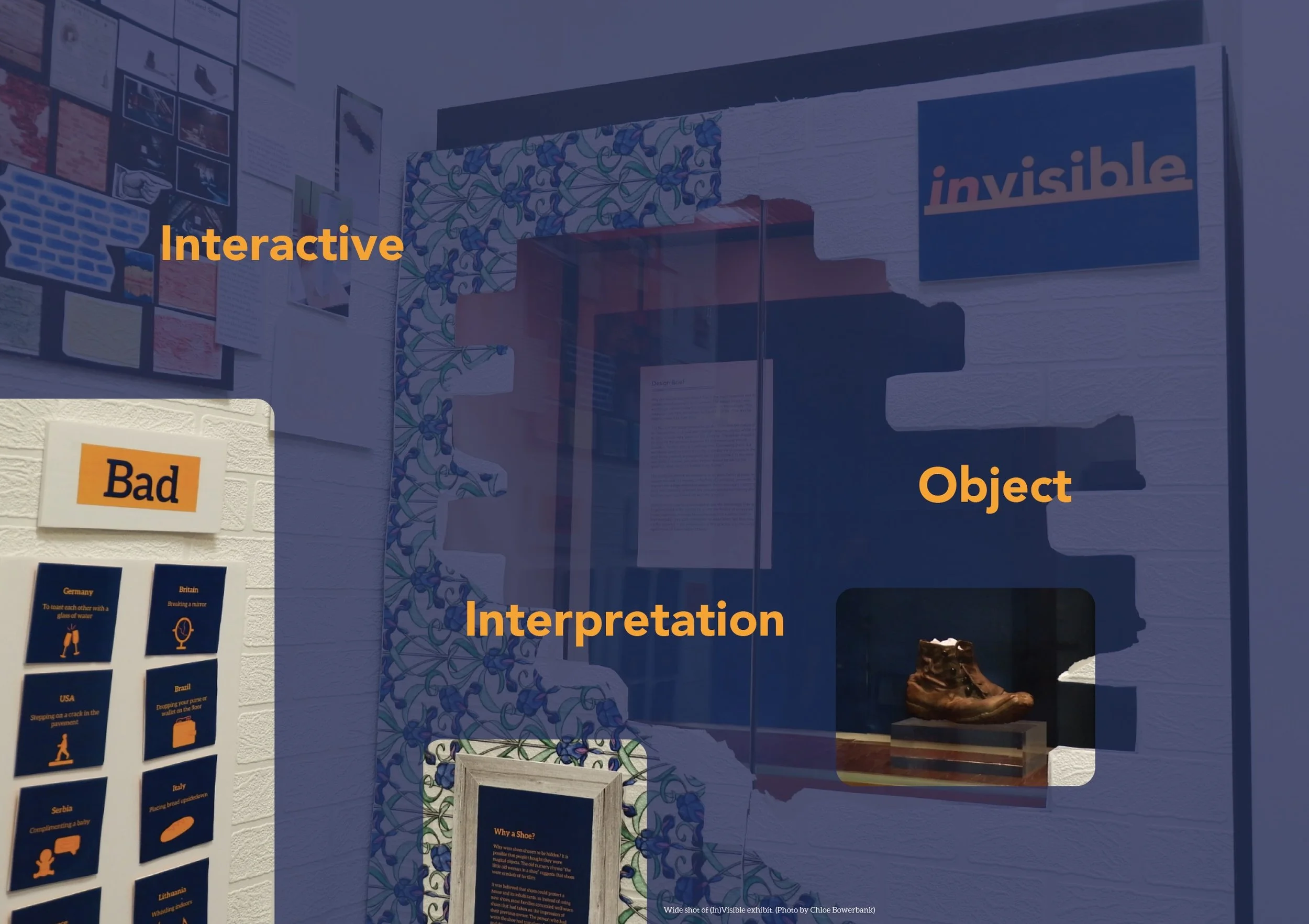
Wide shot of (In)Visible exhibit. (Photo by Chloe Bowerbank)
Physical & Digital Interactives
The effectiveness of interactives is not restricted to its medium. Below are examples of successful digital and physical interactives contrasted with examples of token engagement.
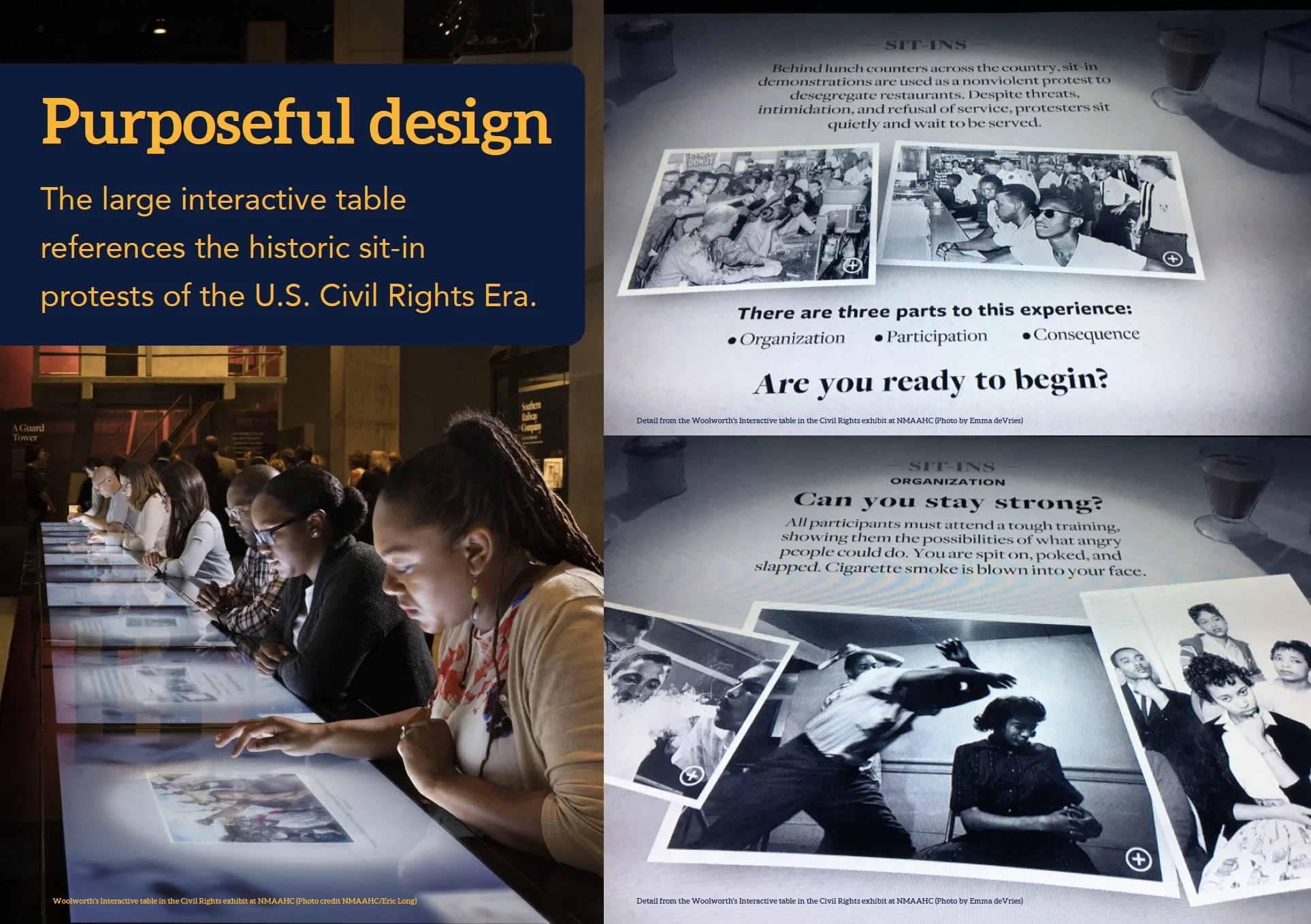
Woolworth’s Interactive table in the Civil Rights exhibit at NMAAHC (photo credit NMAAHC/Eric Long) Top to bottom right: Detail from the Woolworth’s Interactive table in the Civil Rights exhibit at NMAAHC (photo by Emma deVries) and detail from the Woolworth’s Interactive table in the Civil Rights exhibit at NMAAHC (photo by Emma deVries)

U.S. Holocaust Memorial Museum ID card (Photo credit United States Holocaust Memorial Museum, 1995)

Screenshots from 1011 Now video on the temporary exhibit Galapagos at the University of Nebraska State Museum (March 2017)
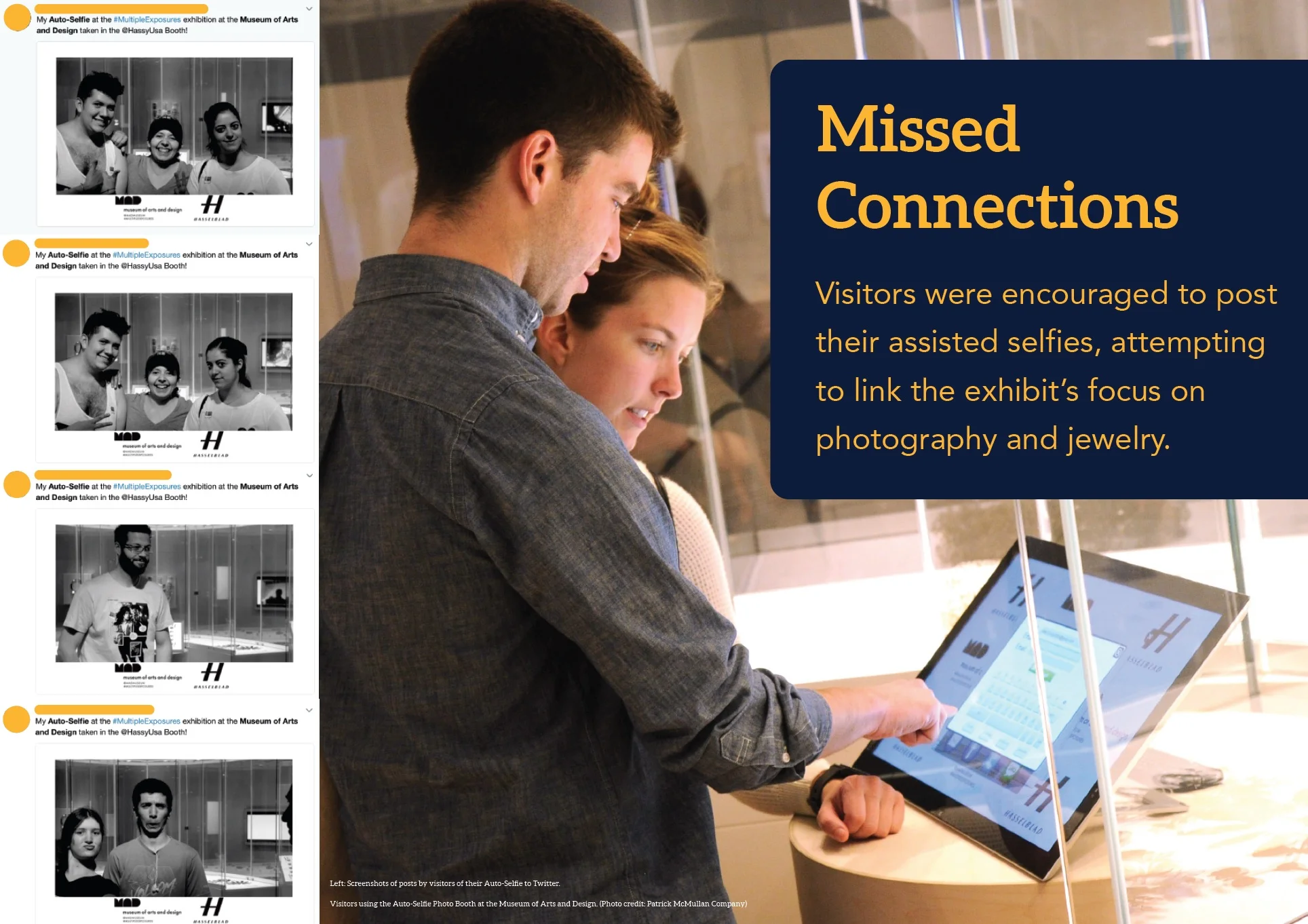
Screenshots of posts by visitors of their Auto-Selfie to Twitter. Right: Visitors using the Auto-Selfie Photo Booth at the Museum of Arts and Design. (photo credit: Patrick McMullan Company)
Woolworth’s Lunch Counter
The Segregated Lunch Counter interactive takes up a large area of the Civil Rights Era section of the permanent exhibition at the National Museum of African American History and Culture. The interactive is designed to teach visitors about the methods and organizational practices used by activists for protests during the Civil Rights Movement of the 1950s and 60s. The table consists of twelve 42-inch multi-touch screens embedded in a replica of the Woolworth’s Lunch table, the site of the historic sit-ins in 1960, the long table is set in front of a 35-foot projection screen, with iconic protest photographs and videos. There is powerful symbolism of taking a seat at the table and the parallel between the iconic sit-in protests
From a “Menu of Movements” visitors can explore sit-ins, freedom rides, bus boycotts, school desegregation, marches, black power, and grassroots leadership. Guests are given prompts to explore the different methods and organizational efforts of activities. Users are asked questions about what they would do in protest situations during the Civil Rights era. Leading them to evaluate their own willpower, determination, and courage when facing difficult choices, they are asked to think about how they would respond if faced with these situations. Visitors can then see statistically where their choices align with past users. Creating a shared moment among visitors.
A feature I did not get the chance to experience was the “facilitator mode”. Educators can remotely control the screens, providing a guided experience aimed at classrooms and group tours.
Identification Cards
Visitors to the US Holocaust Memorial Museum permanent exhibition are given identification cards describing the personal histories and experiences of individuals who lived in Europe during the Holocaust. Each ID card has four sections and these correspond to specific areas within the permanent exhibition: a brief biographical summary, the individual’s experience from 1933 to 1939 corresponds to the fourth floor, the following page is about the War years which is depicted on the third floor, and the final section describes the fate of the individual to the extent that they are known.
Designed as small booklets, about the size of a passport, the cards allow visitors to comprehend the sheer number of victims and see the individuals in the massive statistics. These simple cards ground the horrific scope of the Holocaust and focuses the attention on the people who experienced this event.
The museum developed 600 id cards back in the 90s. Almost half of the cards are stories from survivors. The personal stories that are shared are from individuals who survived internment in ghettos and camps, as well as those who were forced to hide or who were rescued.
This interactive is a great example of “Gift giving” - which is a form of interactives described in Developing Interactive Exhibitions at the Smithsonian (May 2002), by giving the visitor something tangible to interact with and most importantly to take home, the visitor is more likely to develop a feeling of personal connection to the museum and the exhibition. In this case, the id cards also fulfil the museum's mission as a memorial to the millions of people murdered during the Holocaust, whose names and stories will continue to be told and remembered.
Darwin’s Finches
The Finch Game from Galapagos a temporary exhibit at Morrill Hall, this traveling exhibit was developed by researchers and museum specialists from the Zoological Museum of the University of Zurich. It has been traveling since 2012 and I encountered this exhibition during my time at the University of Nebraska. The exhibition was designed in a way to remove barriers between visitors and the objects, and provide many forms of interactives: a flip book animation, ipads with videos and sounds, as well as games. Instead of lengthy text panels a guide book was provided for visitors to take around the exhibit.
One of the larger interactives was a group of activities teaching visitors about natural selection. There were five metal plates depicting finches from the island with different sized beaks. Visitors were supposed to measure the beaks with the sliding instrument and place them on the board in the order of size. Once the plates were in place visitors were instructed to slide a board to see which situations the birds would survive. A bag of seeds and two different sized pliers were provided to help illustrate how birds with smaller beaks wouldn’t be able to break the tougher nuts, which means they would starve, and birds with the shorter, larger beaks would not have the nimbleness to pick up the smaller seeds, meaning they would also starve.
In the end visitors learn that the generalist finch, the one with a medium sized beak, would survive a situation where soft seeds are more prevalent or where hard seeds are more common. The reason I classify this as token engagement is because of the repetitive activities that reiterate the same learning outcomes.
Auto-Selfie Booth
Multiple Exposures: Jewelry and Photography was an exhibition put on by the Museum of Arts and Design in New York City in 2014. It examines how contemporary jewelry artists are using photography to explore modern society, the changing views of beauty and the relationship between jewelry and personal identity.
The museum partnered with Swedish camera manufacturer Hasselblad to create an auto-selfie photo booth. An interactive experience that allowed visitors to pose in front of a camera (which was positioned in front of an interactive tablet) and by smiling the device’s Smile Shutter would take a photo. Visitors would then be able to immediately share their selfie on social media. I found 22 on Twitter all of which say “My Auto-Selfie at the #MultipleExposures exhibition at the Museum of Arts and Design, taken @HassyUSA Photobooth.” with the selfie image attached to the tweet. The generic, museum provided text illustrates perfectly how this interactive was more of a prop than a tool to further develop visitors understanding of the art and common themes that make up the exhibition.
Interactives that are not grounded by detailed learning outcomes, tested and trialed to ensure that those objectives are met, will ultimately hinder the visitor’s experience, if not distract and derail visitor’s attempt at meaning making. This is precisely what happened to Rebecca Herz during her experience in this exhibition with her daughter who was distracted from the exhibit and the auto-selfie booth did not leave a lasting impression beyond the snapshot moment.
Conclusion
If visitors are given the opportunity to shape and personalize their experience, they will leave more satisfied and most importantly retain more from their time in the museum. If museum visitors are not gaining meaning from their time within the museum’s walls, the museum is failing in its duty to provide context, communicate information, and successfully interpret objects for the public.
Acknowledging the visitors role as active meaning makers leads to the development of better interactives which means better exhibitions. Exhibitions that are memorable leave a lasting impression and have far reaching impact on the public.
Bibliography
Bauer, K. (ed.) (2017) Exhibit at Morrill Hall transports you to the Galapagos.
Hannon, V. (2014) How can we build an engaged educational community? YouTube.
Herz, R. (2014) 'What is engagement, and when is it meaningful?', museumquestions.com, 20 Aug. Available at: https://museumquestions.com/2014/08/20/what-is-engagement-and-when-is-it-meaningful/.
Macleod, S., Hanks, L. H., & Hale, J. (Eds.). (2012). Museum making: narratives, architectures, exhibitions. Routledge.
Museum of Arts and Design (ed.) (2014) First Museum Exhibition to Examine Rich Interplay of Jewelry and Photography Opens May 13 at MAD.
Pink, D. (2009) Drive: The Surprising Truth About What Motivates Us. New York: Riverhead Books.
Society for Experiential Graphic Designs (ed.) (2016) The Segregated Lunch Counter and Panorama of the Civil Rights Movement.
Sienkiewicz, N. (2015) 'Creating Meaningful Experiences in Art Museums', in Anderson, D., de Cosson, A. and McIntosh, L. (eds.) Research Informing the Practice of Museum Educators : Diverse Audiences, Challenging Topics, and Reflective Praxis. Rotterdam: Sense Publishers.
Simon, N. (2016) The Art of Relevance. Santa Cruz: Museum 2.0.
Smith, O. (2014) '21 reasons why I hate museums', The Telegraph, 19 Aug. Available at: http://www.telegraph.co.uk/travel/lists/21-reasons-why-I-hate-museums/ (Accessed: 10 Feb 2018).
Smithsonian Institution Office of Policy and Analysis 2002 Developing Interactive Exhibitions at the Smithsonian.
United States Holocaust Memorial Museum (ed.) (2012) Holocaust Identification Cards.
Witcomb, A. (2008) 'Interactivity: Thinking Beyond', in Macdonald, S. (ed.) A Companion to Museum Studies. Wiley-Blackwell.
Zoological Museum (ed.) (2012) Review "Galápagos" on tour. University of Zurich.